Browse
Agri Food Systems
Opportunity: When television was young, there was a hugely popular show based on the still popular f
When television was young, there was a hugely popular show based on the still popular fictional character of Superman. The opening of that show had a familiar phrase that went, “Look. Up in the sky. It’s a bird. It’s a plane.
By:
Anne Miller vijayalaxmi Santosh Mhetre
Thursday, Sep 11, 2025
AGRI-FOOD SYSTEMS
+1

Leave a comment
Opportunity - Many have tried to explain mankind’s seeming obsession with outer space as a result of
https://kcdf.or.ke/our-focus-areas/community-led-development/environmentalist-innovative-challenge-yeic/
By:
Anne Miller vijayalaxmi Santosh Mhetre
Tuesday, Sep 9, 2025
AGRI-FOOD SYSTEMS

No Preview Available
Leave a comment
Article with facebook URL in description
Article with facebook URL in description
https://www.facebook.com/share/v/16uoyPt5iZ/
By:
Anne Miller vijayalaxmi Santosh Mhetre
Thursday, Aug 28, 2025
AGRI-FOOD SYSTEMS
+7
No Preview Available
Leave a comment
Article with Youtube shorts in thumbnail image
Article with YouTube shorts in thumbnail image
By:
Anne Miller vijayalaxmi Santosh Mhetre
Thursday, Aug 28, 2025
AGRI-FOOD SYSTEMS
+7
Leave a comment
Article with normal web URL in description
Article with a normal web URL in the description
https://www.who.int/news-room/fact-sheets/detail/healthy-diet
By:
Anne Miller vijayalaxmi Santosh Mhetre
Thursday, Aug 28, 2025
AGRI-FOOD SYSTEMS
+7
No Preview Available
Leave a comment
Opportunity with twitter link in description
Twitter short
https://x.com/slater57649/status/1949539369649402124
By:
Anne Miller vijayalaxmi Santosh Mhetre
Thursday, Aug 28, 2025
AGRI-FOOD SYSTEMS
+7

No Preview Available
Leave a comment
Opportunity with YT shorts in description
Opportunity with YT shorts in the description
By:
Anne Miller vijayalaxmi Santosh Mhetre
Thursday, Aug 28, 2025
AGRI-FOOD SYSTEMS
+7
No Preview Available
Leave a comment
Opportunity with Facebook link
Opportunity with Facebook link
https://www.facebook.com/share/v/16uoyPt5iZ/
By:
Anne Miller vijayalaxmi Santosh Mhetre
Thursday, Aug 28, 2025
AGRI-FOOD SYSTEMS
+7
No Preview Available
Leave a comment
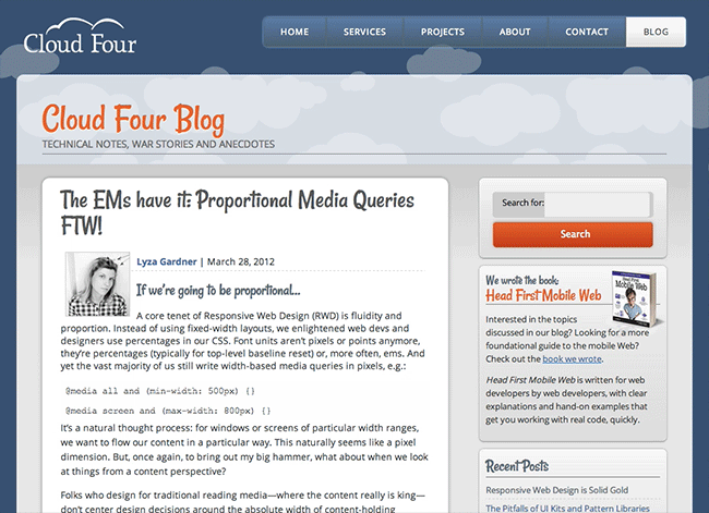
It would be nearly impossible for businesses to design for each and every individual device. Instead
It would be nearly impossible for businesses to design for each and every individual device. Instead, when programming responsive designs, developers often:
Group the styling into the most typical device sizes for phones, tablets, and desktops. In this case, anything larger than 7 inches is usually displayed at desktop resolution or-
Use breakpoints (defined pixel widths that the display will adjust layout based on screen size) dependent upon the design and layout
By:
Anne Miller vijayalaxmi Santosh Mhetre
Thursday, Aug 28, 2025
AGRI-FOOD SYSTEMS
+1
No Preview Available

Leave a comment
Article with embed code in the description
By:
Anne Miller vijayalaxmi Santosh Mhetre
Tuesday, Aug 26, 2025
AGRI-FOOD SYSTEMS
+7

Leave a comment